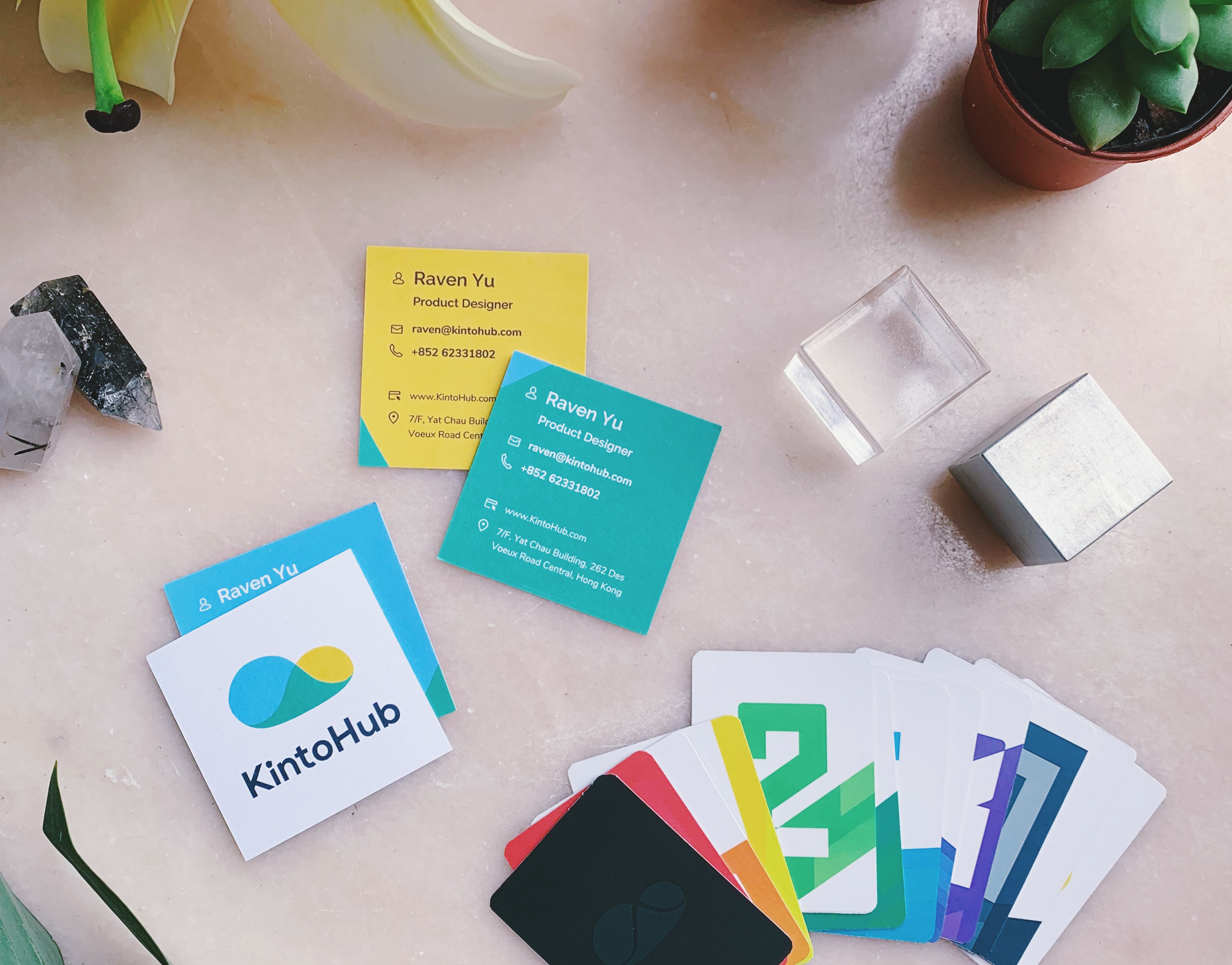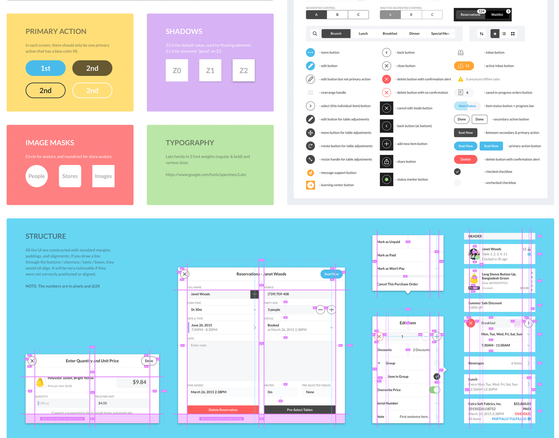
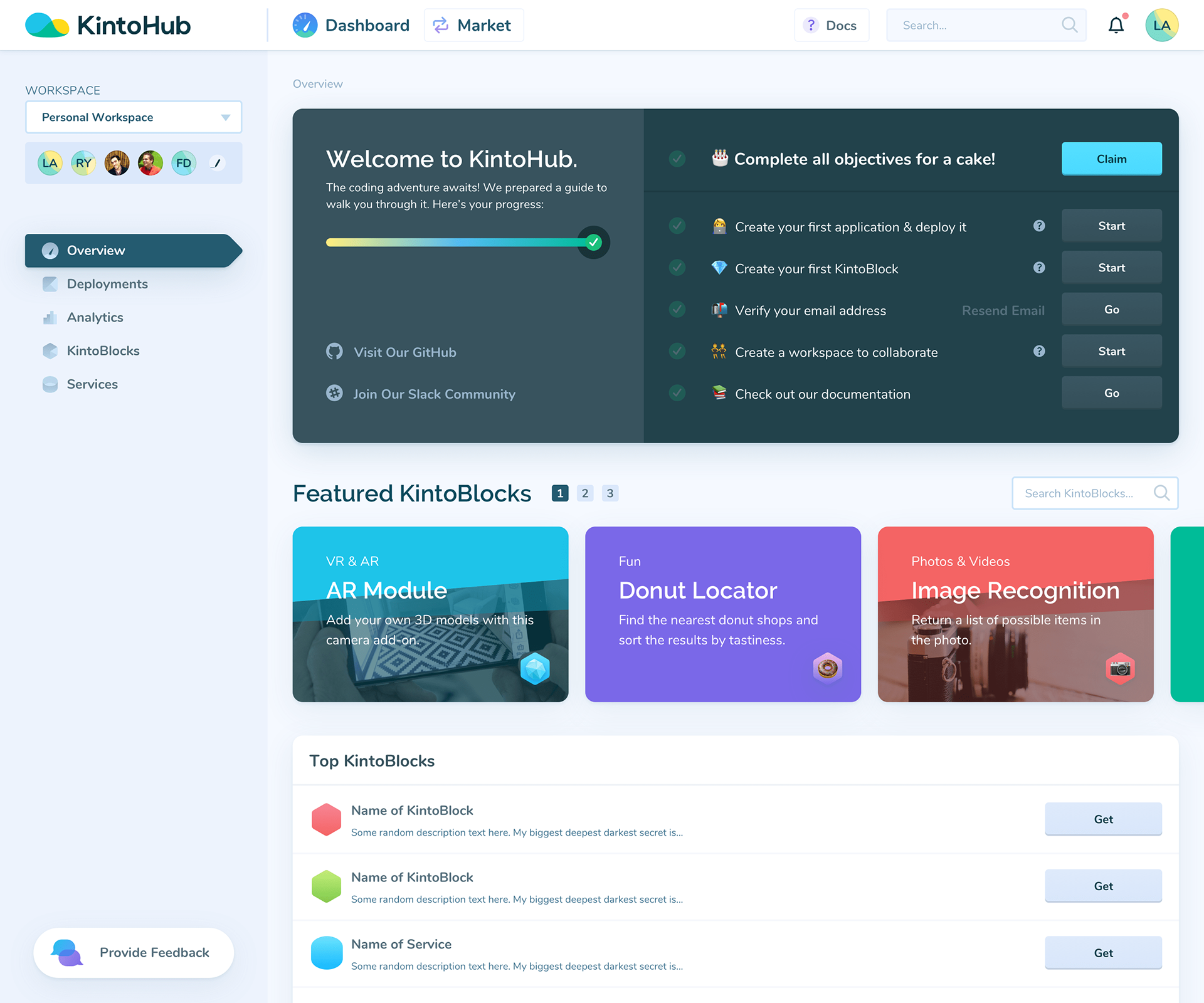
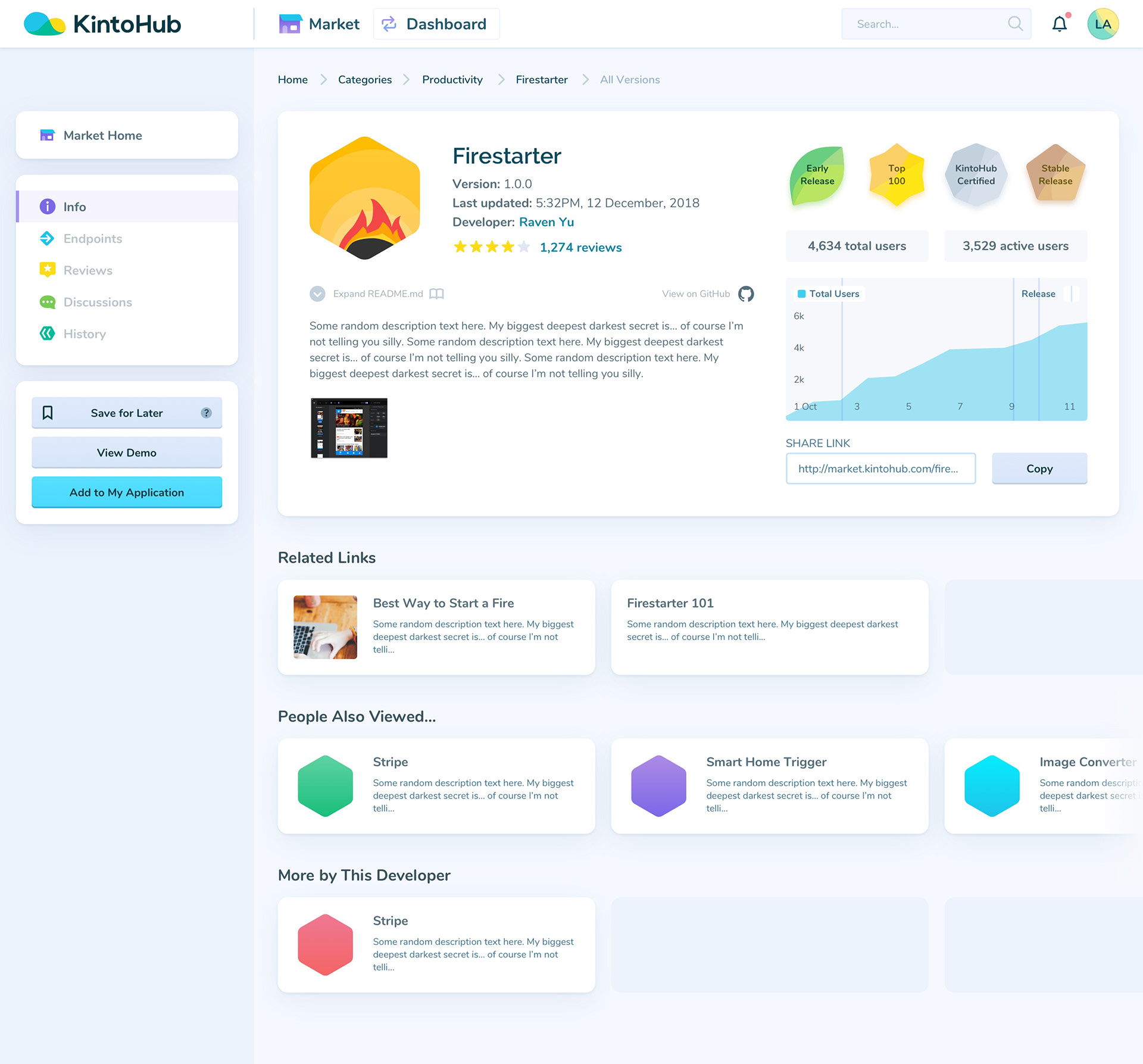
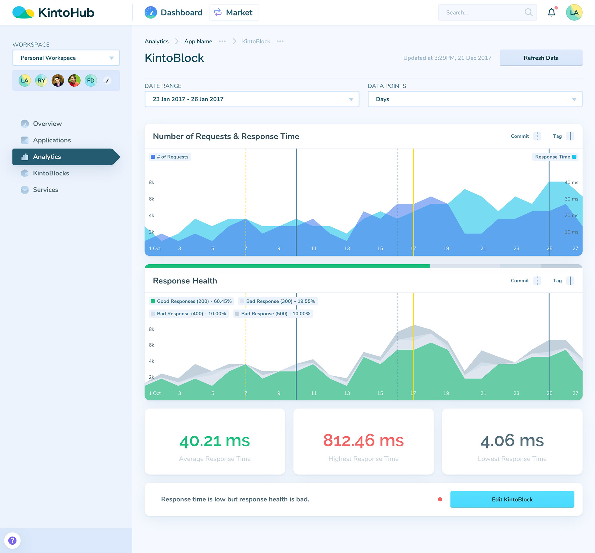
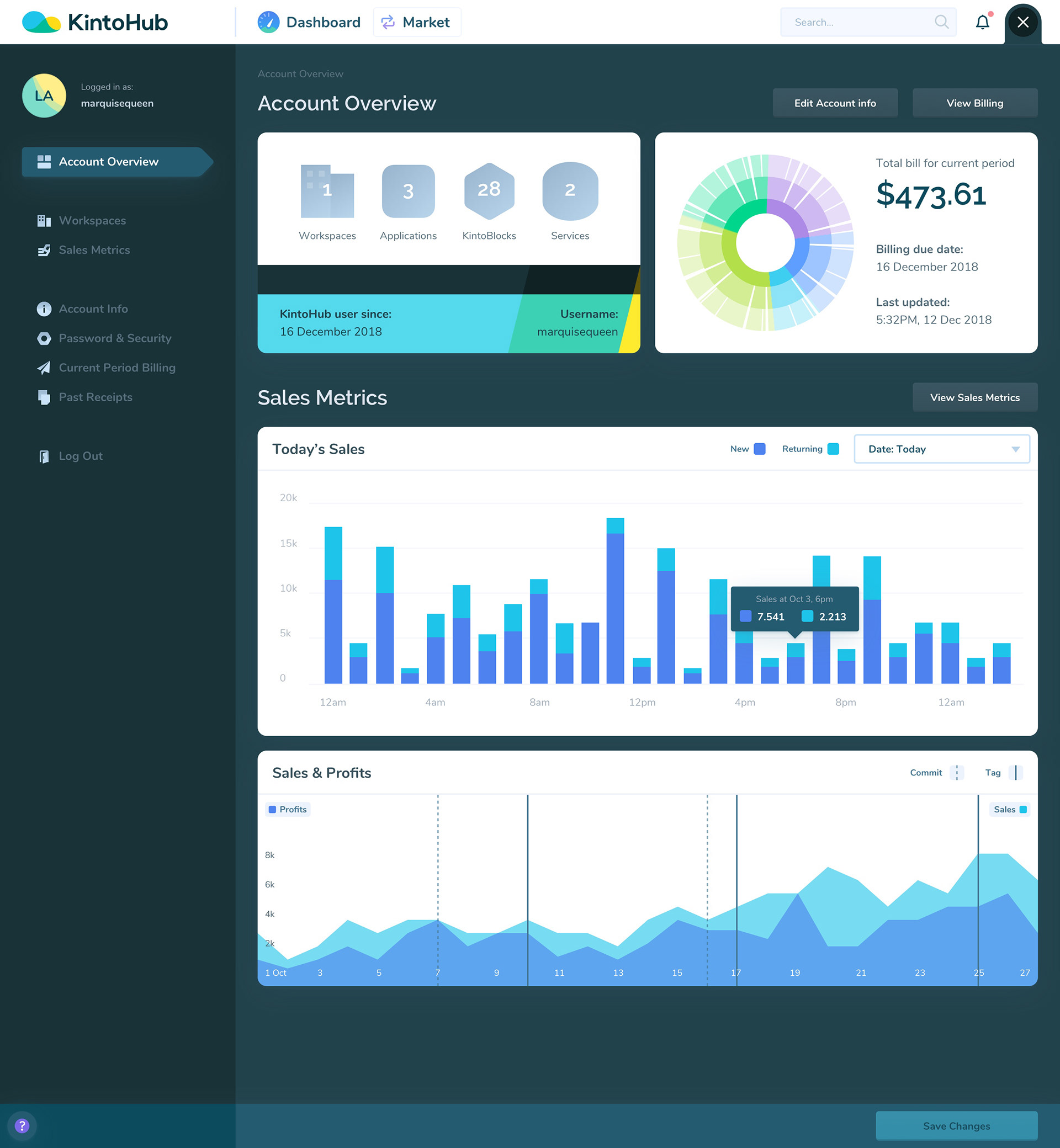
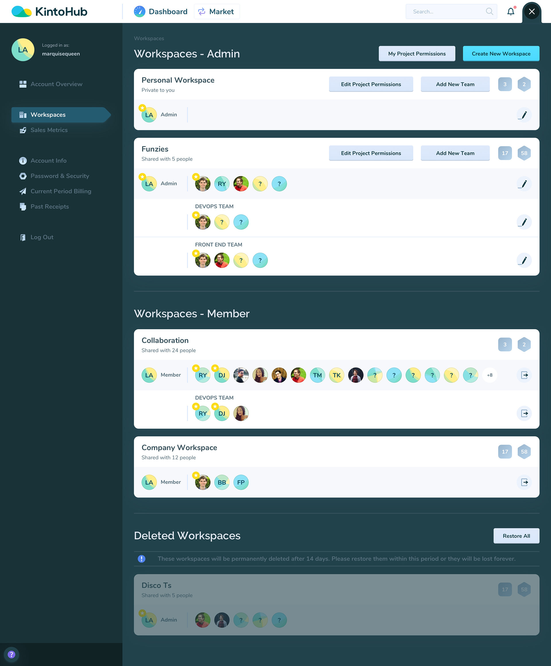
1️⃣ KintoHub Developer Dashboard
Goals: surface advanced features in an easy-to-use but powerful GUI
Constraints: users with varying levels of knowledge, some concepts are very abstract to illustrate
Result: optional onboarding (with a cake 🎂 for incentive!) and hints throughout the platform, layouts that surface frequently used features yet keep advanced features accessible


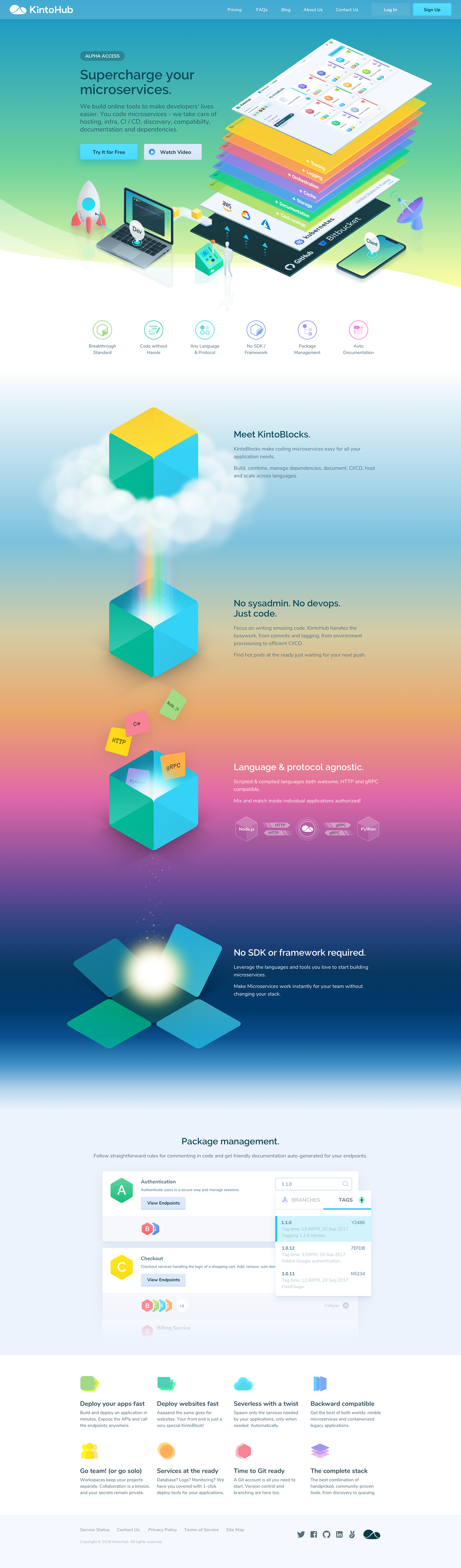
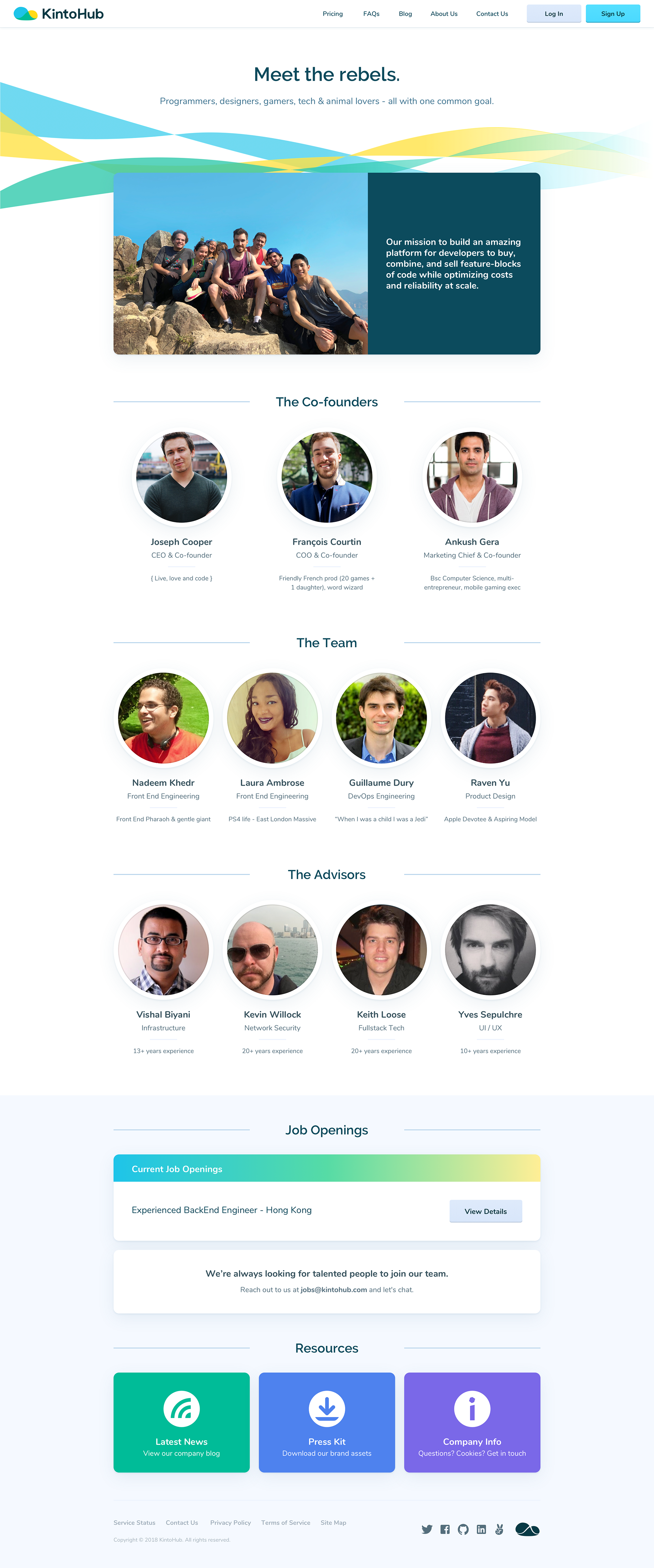
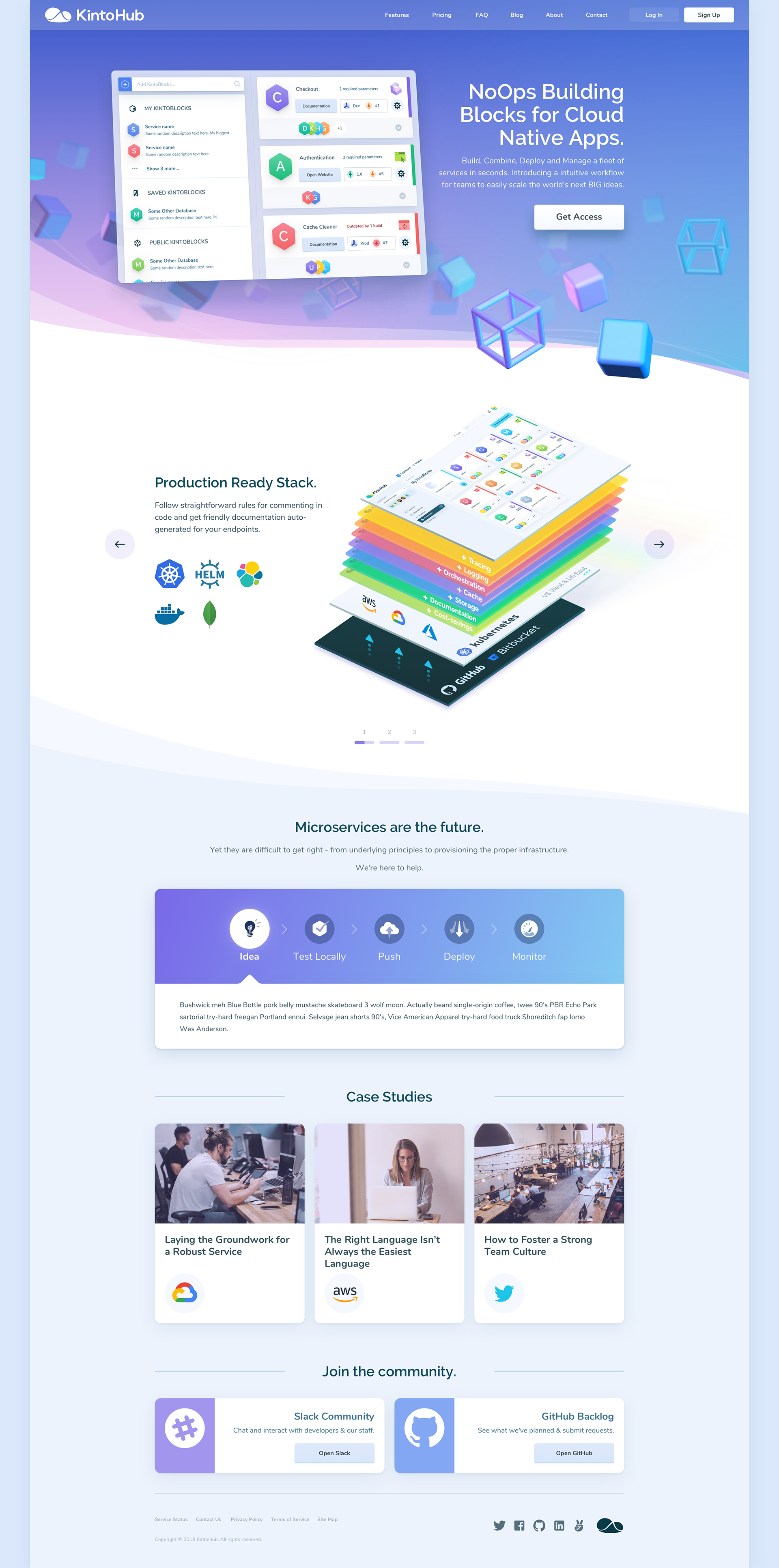
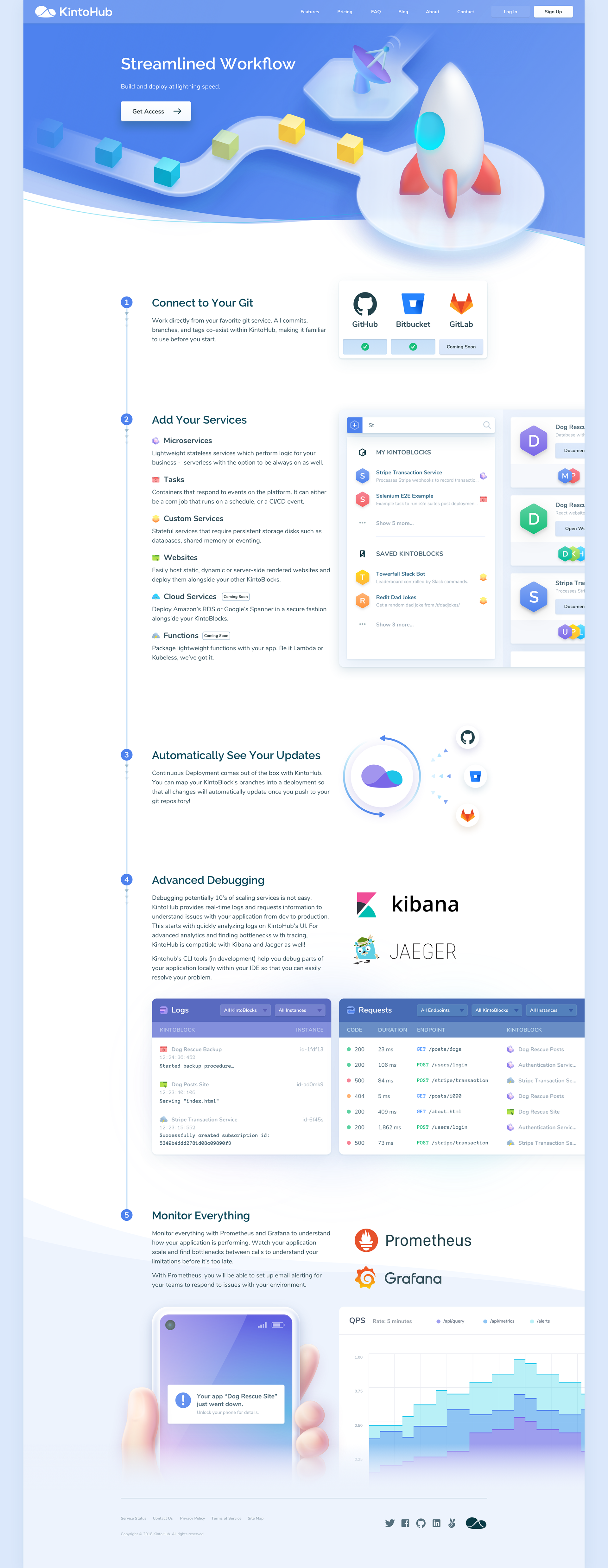
2️⃣ kintohub.com (Marketing Website)
Goals: explain what the platform does, encourage new signups, establish clear branding
Constraints: some concepts are very abstract to illustrate, visitors may be using any device to view the website
Result: liberal use of videos / illustrations / graphs / icons, large and obvious CTAs, testimonials that instill trust, a consistent design system (there was a rebrand, hence the color palette shift), optimize for targeted screen sizes and devices
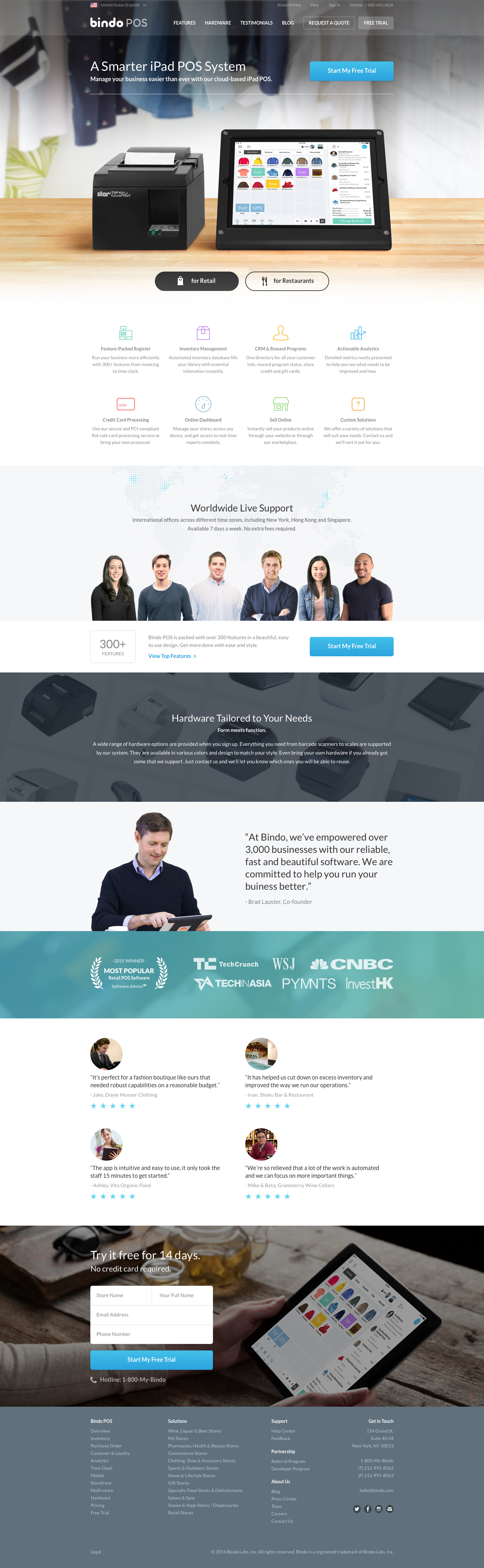
3️⃣ bindopos.com (Marketing Website)
Goals: explain how the product is better than the competition, encourage new signups, establish clear branding
Constraints: directing visitors to either one of the product pages (they are either interested in the system made for restaurants or retail shops, not both), visitors may be using any device to view the website
Result: highlight common features of the 2 products but clearly direct visitors to a separate page for each product, a signup process that works for both products, large and obvious CTAs, testimonials that instill trust, a consistent design system, optimize for targeted devices
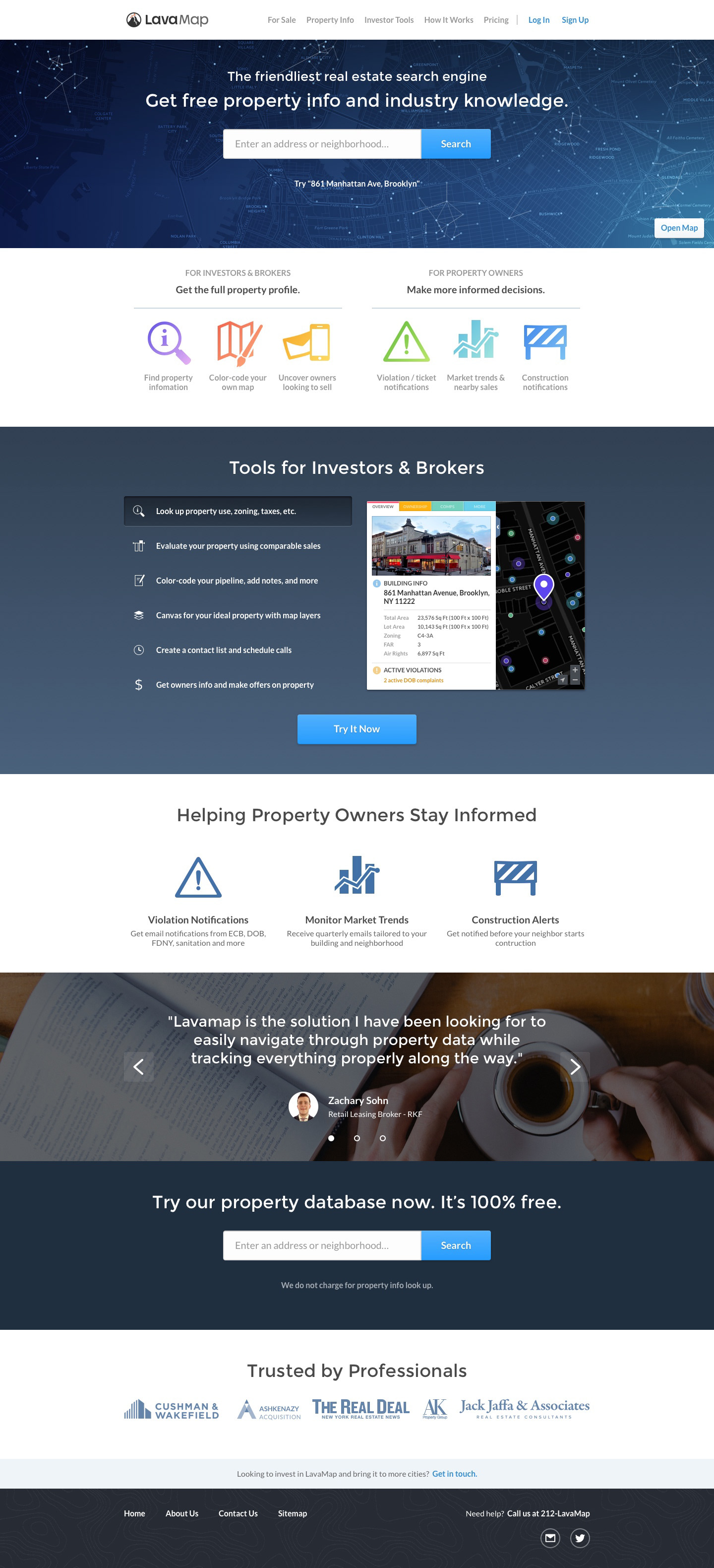
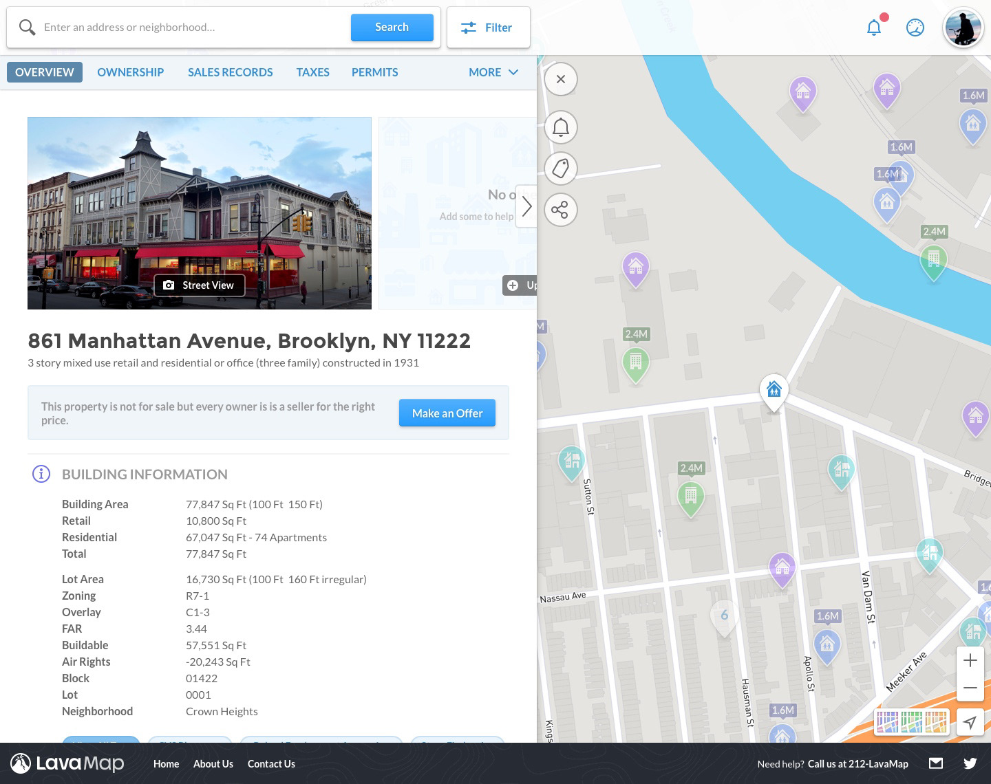
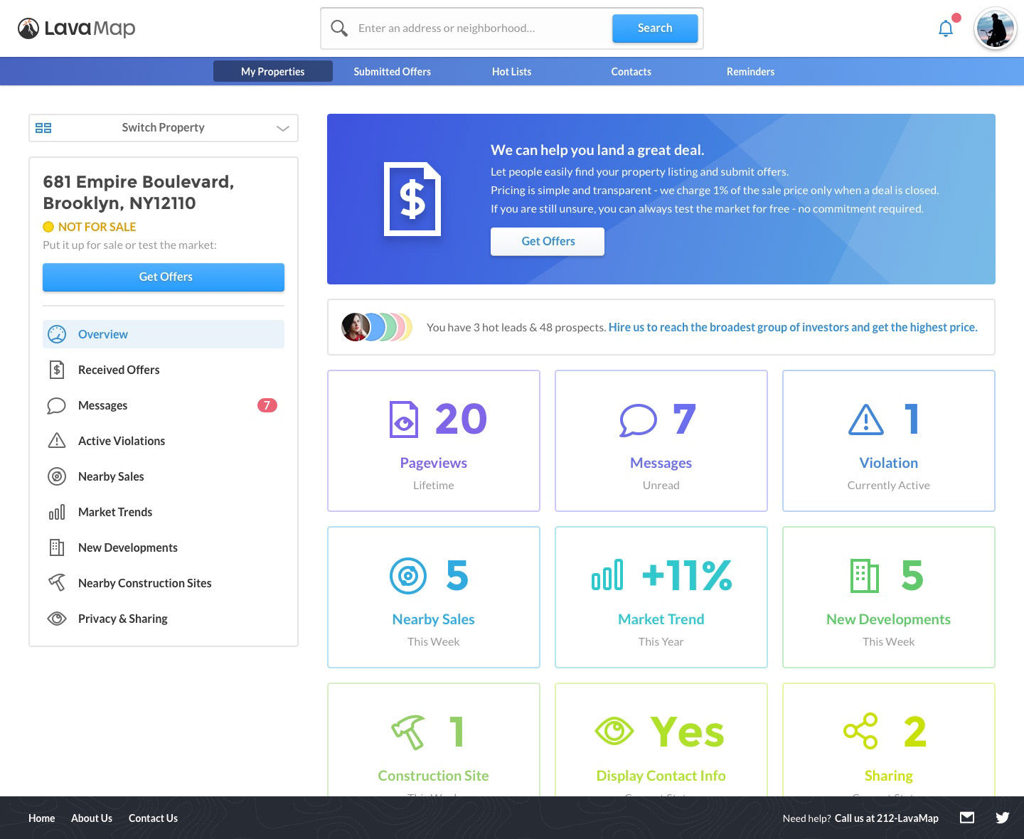
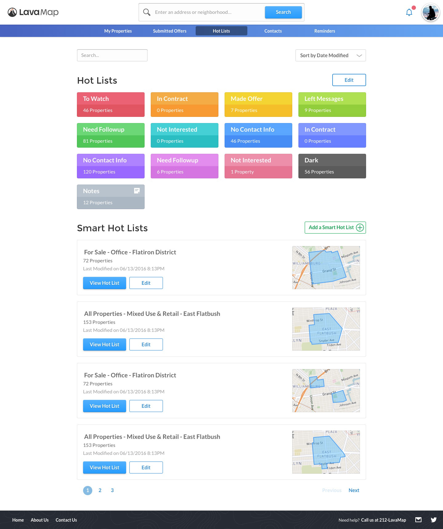
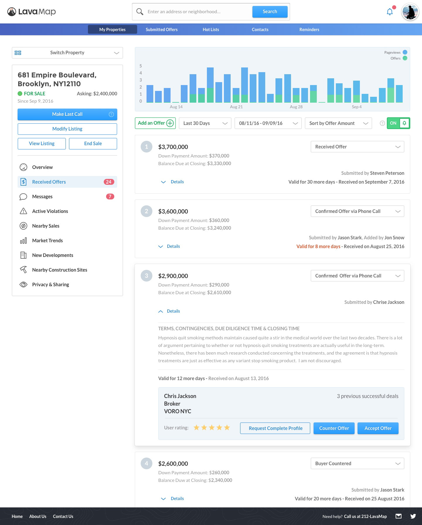
4️⃣ lavamap.com (Marketing Website + User Dashboard)
Goals: let visitors to use the product immediately, explain what the platform does, encourage new signups, establish clear branding
Constraints: homepage is also the main product entry point, visitors may be using any device to view the website
Result: prominently featured search box for visitors to jump right into the product, large and obvious CTAs, testimonials that instill trust, a consistent design system, optimize for targeted devices